Explore our IP Address Database Downloads for instant access to our IP address insights
Learn moreHow to personalize your landing page pre-signup
Before the internet, company-customer relationships were cultivated at neighborhood, brick-and-mortar stores.
Customers could walk into their local corner store, speak to the same employee who’s been serving them for years, and get exactly what they were looking for with almost no effort.
In terms of the company-customer relationship, these corner stores served two important functions:
- They made customers feel known and appreciated.
- They gave customers the exact product they were looking for — without requiring the customer to put in much effort.
In part, employees could give customers what they wanted because they knew context — how the customer found out about their business, location — where the customer lived, and firmographics — what industry the customer worked in.
Although many blame the internet for taking away this personalized experience, you can still make your customers feel at-home online by paying attention to these 3 key factors: context, location, and firmographics.
In fact, you can use context, location, and firmographics to make customers feel at home even before they become customers. By personalizing their landing pages — the first page viewers see — businesses are able to show viewers that they know who they are, what they want, and how to meet their needs. Landing page personalization starts to create the relationship that brick-and-mortar stores spent years establishing.
Once you’ve proven your relevance to viewers and begun to establish this strong relationship with them, they will be more inclined to convert and make a purchase. In this article, we show you how to speed up this user-to-customer transformation. We walk you through 3 key strategies to personalize your landing page based on context, location, and firmographic information, and show you examples of businesses who’ve successfully implemented personalization into their own web presence. Then we’ll give you step-by-step directions on how to do it yourself.
Personalization by Context
The first key strategy to hooking viewers at the landing page is understanding context: knowing exactly how viewers arrived at your website.
Knowing how viewers ended up on your website can give insight into why they’re interested in your company and product. If you take this information into account in your landing page design, you’ll do far more than make users feel comfortable and understood — you’ll encourage them to stay and make purchases.
What We Mean by Context
To understand the context for how a viewer arrived at your site, you can look at two key pieces of information about the viewer:
- Traffic source: This refers to the search engine someone used to get to your landing page.
- Words searched: This refers to the exact words guests used to find you.
How it’s Important for Your Business
Context is hugely important for creating that welcome feel that customers previously only got from a mom-and-pop corner store. This welcoming feeling will also make viewers more inclined to trust your company — enough to sign up for a subscription or make a purchase.
Knowing whether your guest navigated to your site through Google, through a blog post, or through an ad can make a huge difference in determining their behavior, desires, and needs. Similarly, knowing the exact words viewers typed into a search bar tells you exactly what they want or need.
How Others Have Personalized by Context
Other businesses that have designed their landing pages with context in mind have seen similar boosts in conversion and revenue.
Context personalization helped Rockwell Automation, a global manufacturing company, make significant gains in viewer response rate and also lower their bounce rate.
Before personalizing their website by context, Rockwell had a generic landing page about its corporate responsibility (see the default page below). Although perhaps interesting to a few viewers, a highlight of the company’s principals from the outset is probably not what most viewers are looking for on their first go-round.
And they made that quite clear — by leaving.
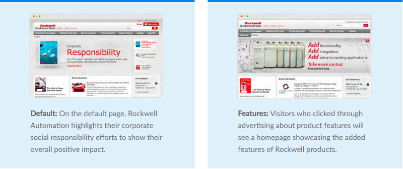
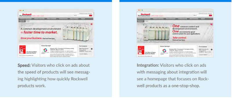
Rockwell distributes products across more than 18 different verticals. That means they spend a lot of money on ads so people know about the great products they offer.
They didn’t want to waste this investment in time or money, so they made the decision to personalize the company landing page based on the specific ad that drove customers to their site.
Once Rockwell noticed that their viewers were leaving quickly and failing to convert, they started tracking the ads that brought in the most viewers: those that focused on the company’s features, speed, and integration.
They segmented the people who viewed those ads into their respective categories and ensured that they were sent to different viewing pages based on what ads attracted them to Rockwell:
- If they wanted to learn more about its features, they were sent to a landing page that details the interesting aspects of every Rockwell product.
- If they wanted to learn more about the company’s speed, they were sent to a landing page explaining how its products work faster than anything else on the market.
- If they wanted to learn more about Rockwell’s integration, they were sent to a landing page explaining how the company is able to meet all their needs in one place.
Rockwell personalized by context, and it won big. The company saw conversions on form submissions increase by 23% and bounce rates decrease by 28%.
How You Can Personalize by Context
One of the best sources of incoming visitors is through organic search traffic because you know visitors are searching for something related to your product and have a need to fill. If you can target certain keywords and phrases so that your landing page shows up high on the results page of their search, you increase the likelihood that they’ll see you as a solution.
This is a great way to personalize based on context: for visitors coming to your landing site through organic search, you can craft the page exactly around what they’re searching for.
You can better connect with customers and drive up engagement by using SEO strategies to create your landing page. You can improve the chance that your website is one of the first in their results by including a few key features that search engines find important:
- Define your own URL: You’ll need to resist the urge to publish your website in a subdomain of your content management system. Although this approach might seem like less of a hassle, viewers might become confused about your brand, who it is associated with, and seek out brands comfortable enough to publish on their own domain.
- Pick your keywords: Perhaps the most important step, picking your keywords makes sure that viewers are directed to your page once they enter certain words or combinations of words into a search engine. That means you’ll have to brainstorm what words are most relevant to your landing page and imagine how users would input them into a search engine.
- Optimize your page’s SEO through tags: You can make sure that your landing page pops up in a search using these keywords by including them in tabs on your landing page. This might include the title tag, the description of your page in the search results, and in your header tags, for example.
- Do what you can to get backlinks: You want to make sure that others are spreading the word about your page. There are a few different ways to ensure people are linking back to your website, including publishing original content and forming strong relationships with influencers in your field.
Once you’ve taken these steps to make sure that your page is customized to meet your viewers’ needs and it is the first result they’ll see after a search, you’ll begin to see your own returns — with happier viewers, more customers, and higher revenue.
Personalization by Location
Once you’ve customized your landing page to viewers’ needs, you’ll need to make sure that the landing page reflects their cultural interests and diverse backgrounds. You can do this by personalizing by location.
Below, we show you how to use your viewers’ locations to make them feel at home with your company — enough to motivate them to want to get to know you, your product, and commit to making it a part of their lives.
What We Mean by Location
There are two main components of a visitor’s location that affects how they’ll interact with your site:
- Long-term location: Where the viewer lives
- Current location: Where the viewer is right now
How it’s Important for Your Business
Being familiar with your viewers’ long-term and current locations is important. Knowing where your viewers are from can help you personalize your landing page to take into account regional expressions, interests, and culture — all of which will make your viewer feel like you have a better sense of who they are and what they need.
Let’s look at a company that’s consistently proven itself as a great online host to customers across many locations: Hertz.
How Others Have Personalized by Location
Hertz makes its anonymous viewers feel at home before ever speaking with a customer rep. That’s because it takes personalization seriously via viewer long-term location.
After identifying where its viewers lived, Hertz made sure to direct them to landing pages that were culturally reflective of their home.
Below, you’ll see two of Hertz’s landing page: The first is for those who live in Singapore, the second is for those who live in Chile.
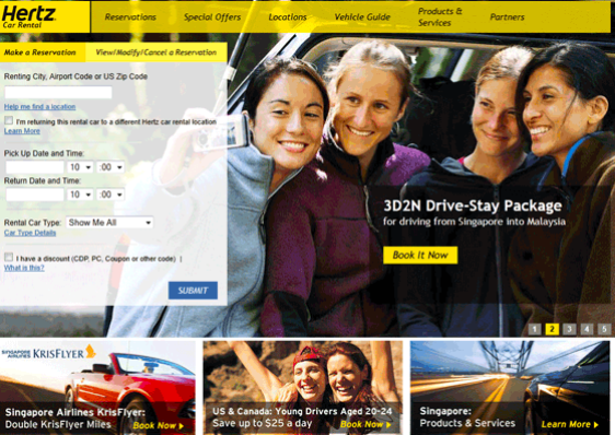
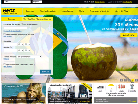
Each landing page takes into account regional climate, interests, and culture. The landing pages are customized on the most granular level: even the colors in the Chilean page are those of its national flag. This helps users better see how Hertz is committed to representing and serving them specifically.
The Singapore page makes a comparably positive first impression; by featuring an incentive offered by the country’s national airlines, Hertz shows its viewers that it is deeply invested in improving their lives on a more localized scale and in fostering relationships with Singapore business.
By adding just a few, simple changes to their landing pages to personalize by location, Hertz was able to ensure that its first-time website users felt comfortable, understood, and taken seriously by the company. This feeling of comfort and appreciation is one that will help inspire users to convert because they know your company is aligned with their own values far more than any of your competitors.
How You Can Personalize by Location
You can easily make your viewers feel just as comfortable by creating location-specific landing pages.
In practice, that means using easy code to track the location of all your viewers and then make sure that they are going to appropriate landing pages.
For instance, take this code sample below:
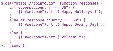
After tracking where its viewers were coming from (see the first-second lines of code), this company modifies greetings on each of their landing pages to best accommodate viewer interest.
You’ll be able to start connecting with and converting anonymous viewers by simply inserting a few if-else statements into the code for your business’s website design.
Personalization by Firmographics
Firmographic information about your site visitor can help you fill in some last important blanks about who they are and what they’re looking for.
With this background knowledge, you’ll most likely have a better sense of your viewers’ values and perspectives. This information will help you navigate your conversation with them, emphasizing topics you know they’ll appreciate while also avoiding those you know they won’t.
By knowing the kind of family your user comes from — in this case, the business they come from — you can have a better sense of where their priorities lie and what they want to accomplish by doing business with you. You can make sure to tap into these values and motivations by personalizing your landing page to reflect and address them.
What We Mean by Firmographics
You can personalize your landing page by firmographics when keeping in mind 3 key components:
- Industry: Knowing the kind of field your viewer works in helps you ensure that your landing page features products and content relevant to their business
- Business Size: Having a sense of whether your viewer comes from a small start-up of 20 or from a multinational corporation will help you personalize the landing page to best meet the viewer’s business needs
- Business Structure: You’ll be able to personalize your landing page even further by knowing your viewer’s business structure. Depending on whether your viewer comes from a flat structure or one more hierarchical, you can use this information to effectively frame your product and its value for them.
How it’s Important for Your Business
Keeping these easy components on your radar can help you best communicate that you understand who your viewer is, what they want, and how your business can meet their needs. Perhaps more importantly, you’ll incentivize them to keep coming back long after they’ve seen the landing page.
Motivating your viewers to return to and purchase from your website after visiting the landing page is important. As with context and location personalization, you’ll see an upsurge in revenue.
How Others Have Personalized with Firmographics
Iomega, a storage product manufacturer, was able to boost their own revenue by personalizing their landing page using viewer firmographics.
At first, iomega directed all viewers to one generic page, shown below.
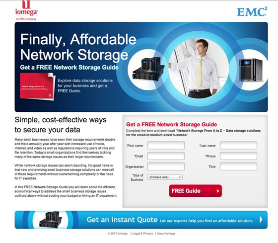
This page fails nearly across the board in personalization. Aside from obviously targeting people interested in storage, this landing page doesn’t differentiate for any other kind of customer. There is some oddly placed information about data security and an offer for a free network storage guide, but the viewer has no sense that iomega knows who they are, what they want, and how it can meet that need.
After realizing that their landing page did little to improve viewer conversion, iomega made a change.
They personalized their landing page by firmographic data. The new landing page, shown below, shows a much clearer attempt to understand and meet viewer needs.
The new page is improved in that it:
- Divides its viewers between small businesses and remote offices/distributed enterprises
- Gives viewers more autonomy over their experience by allowing them to choose the landing page most applicable to them
- Provides a short description below each landing page choice of how EMC2 can help them.
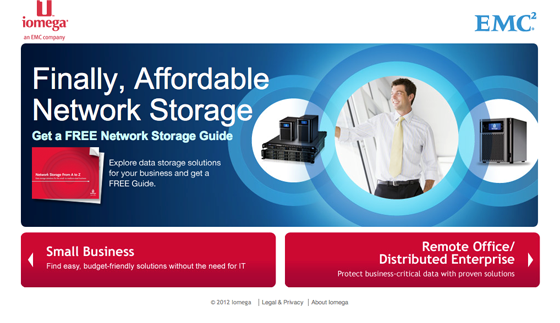
Depending on whether the viewer is a small business or is a distributed enterprise, they will be redirected to different landing pages. These landing pages feature products that are more specific to the viewer’s specific business needs and ensures that they don’t feel confused or perturbed by generic content.
Iomega made a great change for itself. It increased lead generation and form completions by 110% at a 99% confidence level and saw revenues soar.
How You Can Personalize by Firmography
You can experience similar accomplishments with a few minor code changes. Ipinfo offers a tool that easily makes this change in code.

Their IP to company API will give you the name of your viewer’s company and domain. This is extremely helpful for knowing how to best personalize your page by firmographics.
With the help of Clearbit, a company providing products and data APIs, you can also get access to the specific individual and the company who performed a search.
Clearbit’s Clearbit: : Leadscore.lookup can take an email or domain and give you a response that details the person associated with the email and the company associated with the email’s domain.
Using both or a combination of these tools can help you target the people you need to and design a landing page that shows them that you know who they are, what they want, and how you can meet their needs.
The Bottom Line: A Feeling of Comfort and Appreciation for Your Viewers
John Ewing, CMO and CTO of BMI research, a global research firm covering over 200 industries, offers us a salient example of why contextual, location-based, and firmographic personalization is just so important.
After realizing lags in the number of visitors to their website and the rate of visitor conversion, John Ewing and his team at BMI knew they had to make some changes. He and his team transformed BMI’s one, generic landing page into over 200, each representative of the industries they serve and each customer’s journey. The company saw a significant shrink in the disparity between viewers and conversion. Within just a few months, they saw a 25% spike in conversions.
For John, this success pointed to one fundamental truth: viewers want to see a part of themselves in your company and product.
“On your first-ever visit to the site, we could show you something that would resonate with you. That was the holy grail and it actually worked. This is a huge competitive advantage for us.”
There’s one simple idea that ties together contextual, location-based, and firmographic personalization. All 3 methods make your viewer feel known and appreciated — providing you and your company with perhaps one of the strongest tools to keep them with you long after the landing page introduction.
IPinfo is a comprehensive IP data and API provider with flexible pricing plans to meet your business needs. We handle billions of API requests per month, serving data like IP geolocation, ASN, IP to company, and more. Sign up for a free account or contact our data experts to learn more.
About the author

Internet Data Expert