 My IP ↗or
How to personalize your website before you know anything about your site visitor
Most marketers wait too long before providing a site visitor with personal experience.
You have three seconds to leave an impression on your consumer with your homepage, or they’ll bounce for good. But when they navigate to your page, they’re hit with generic, impersonal marketing copy and design. Only the brave few who volunteer their email address, their gender, their browsing preferences, and their first unborn child will get the type of personalized experience that grabs their attention.
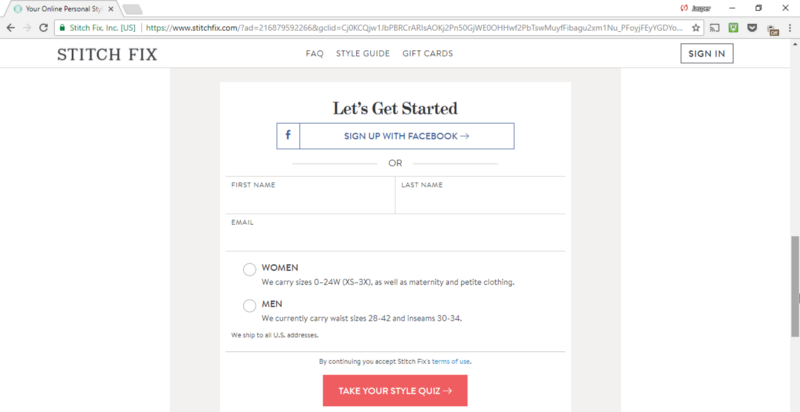
This is too little, too late.
To capture the attention of the largest percent of site visitors, you need to customize your landing page for a personal first impression. For this, you can use the one piece of data you do have already: location.
Give First, Ask Later
Personalization works because it brings back the type of experience we used to get in brick-and-mortar stores. Shopkeepers used to point us to what we were looking for, give recommendations based on our style, and help us make carefully calculated decisions about what next purchase to make. They did all of this before asking anything of us.
The online experience is considerably more alienating, because you don’t know who you’re talking to. You can’t have a face-to-face conversation, so all those personal details that would help you serve your customers elude you. You don’t know what they look like, what their shopping preferences are, or even what language they speak. Creating any kind of one-size-fits-all homepage only distances you further.
Instead, you need to use personalization to drive the user experience from the first touch — not hope that they make it through a sign-up or a paywall. And you can do this through one detail that you have on all your site visitors: their IP address.
Location can tell you much more than what language to display your site in or whether to put a “$” or a “£” — they tell you a person’s culture, one of the biggest influencing factors in a person’s preferences and personality. This gives you loads of details about who the person is and how they interact with the world, such as:
- their familiarity with particular brands
- their mode of transportation
- the weather and seasons they experience
- their national or city-specific holidays and festivals
- their potential recreational activities
Folding these details into your homepage copy and design will help you make a more personal connection from the beginning. Here are four ways to customize your website before asking anything of your visitors.
Local Social Proof for Better Credibility
When site visitors first stumble upon your website, nothing you say about yourself is credible yet. Consumers want proof from elsewhere: other people or brands that they already know and trust. The only issue is that credibility isn’t universal.
Robert Cialdini, emeritus professor of psychology known for his work on the science of persuasion, proved this in an experiment on social proof. He discovered that the amount of social proof wasn’t nearly as important as the familiarity with the people vouching for the product. People gained conviction to take action and donate when they saw that others like them had already made the choice.
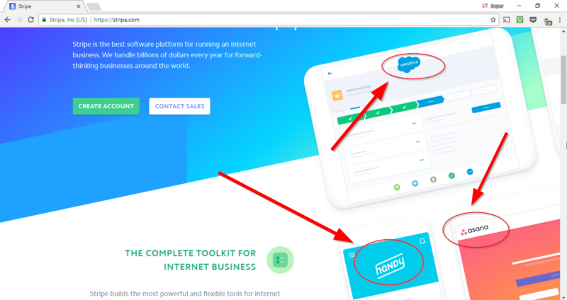
Stripe, responsible for the payment feature for hundreds of businesses across 25 different countries, leverages their global customer list to create location-specific social proof for their homepage.
If you navigate to Stripe’s homepage, one of the first things you see is the claim that they’re “the complete toolkit for internet business,” and the brand names to prove it — Salesforce, Asana, and Handy are sprinkled across the floating monitors in their design:
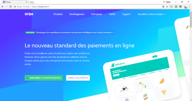
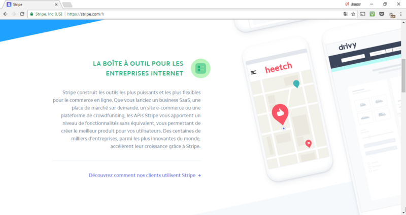
But when you head over to this site from a Parisian IP, you see different brand names: Deliveroo, Heetch and Drivy.
If you’re perusing the site from a Berlin office, you’ll see a different one yet:
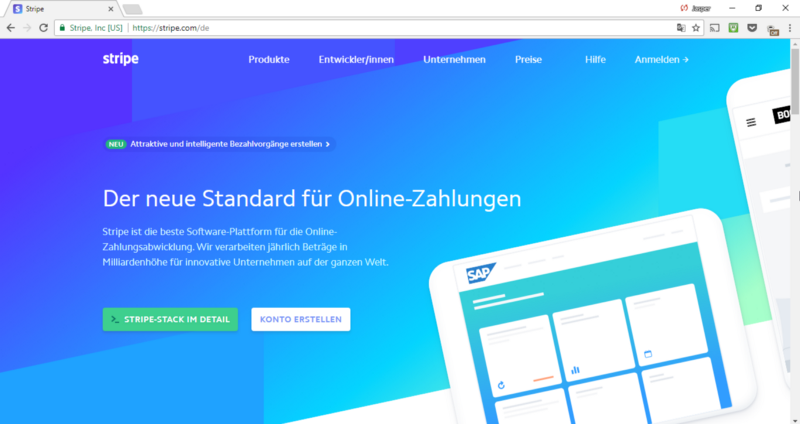
The adjustments to the designs are minor — they simply fill in the computer screens with the appropriate images and brand names. Then, they adjust the CTA to ensure that it takes site visitors to the appropriate testimonials.
This small detail goes a long way in convincing companies about the legitimacy of the product. A New Yorker is impressed by a Salesforce reference, a product they might personally use at work, or whose tower is one of the highest in the city skyline. Heetch or Deliveroo, however, won’t even catch their eye.
Zomato, an India-based food search has taken it a step further. Rather than just feature user testimonials, they built out an entire feature that enabled reviewers to become influencers.
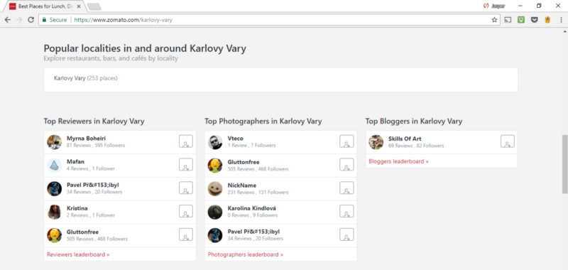
When you navigate to their homepage, you’ll find suggestions for reviewers, photographers and bloggers who are city natives for the site visitor. In Karlovy Vary, you’d see a page that looks like this:
While in New York, you’d see different names and faces:
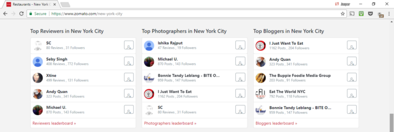
Zomato is creating opportunities for diners to become bloggers and influencers. This simultaneously gives Zomato credibility for site visitors and encourages deeper engagement with the app once those visitors becomes customers.
Testimonials are an excellent way to connect with new site visitors, but only if they have familiarity with who’s providing them. Use this location-specific information — like what consumers they’re near, or what brands they’re acquainted with — to make for a more relatable first-time experience.
Recs Based on Local Data for Higher Temptation
While many of us may consider ourselves prudent shoppers, 1 in 5 consumers make impulsive purchases once a week. Whether it’s that pack of candy at a physical check-out aisle or that $2.99 Amazon movie, we’re all susceptible to give in to instinct and buy what we want right here, right now.
Marketers capitalize on this impulsive drive with targeted ads by offering Facebook or Instagram browsers deals based on the segment’s behaviors on the platform — but fail to get through to first-time site visitors, whom they know much less about.
Using a visitor’s location, however, you can provide deals and offers based on their neighbors’ preferences. Rather than showing the “most popular” options across cities and continents, make recommendations based on the geographic segment.
Tripadvisor, for instance, places flight and travel recommendations on the homepage that reflects the most popular deals for the particular geographic segment. A visitor from Madrid would see flight recommendations for London and Paris:
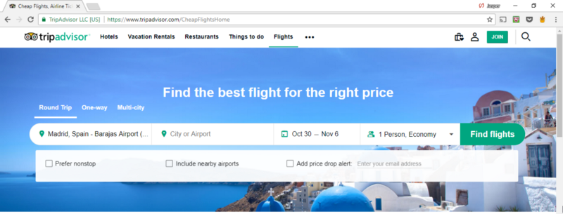
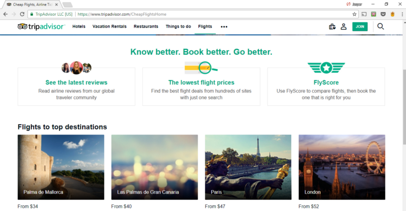
— while a Hong Kong native would see recommendations for Taipei and Manila:
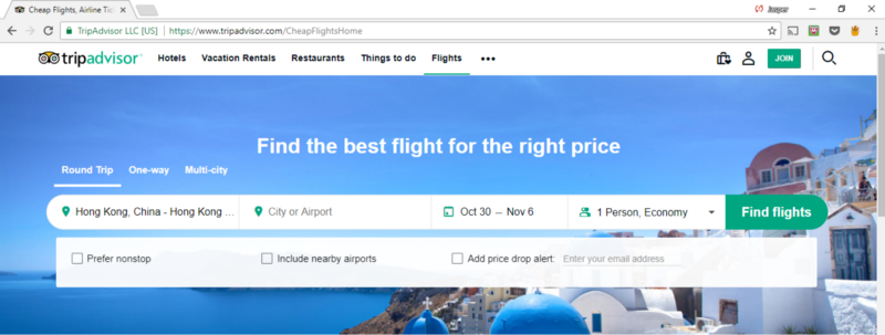
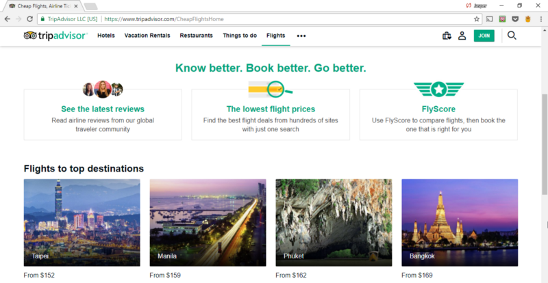
To make purchasing even swifter, Tripadvisor fills in your “from” destination based on your IP address, so there’s very few clicks between the first time impression and a booked flight for a summer holiday.
Where and how you vacation is extremely culture and location-specific. While 13 million British citizens vacation in Spain every year, their neighbors to the north much prefer France and Germany.
With these recommendations, Tripadvisor tries to increase the odds that they’re suggesting a vacation that’s been on the site visitors’ radar — a place that is popular enough that a friend or relative would have recently recommended. This context-specific data is what allows them to connect more personally with site visitors.
Local Imagery for Better Familiarity
As humans, we crave the familiar. The more we’re exposed to certain stimulus, the more likely we are to deem it “safe,” and feel a particular fondness for it. The effect of familiar imagery on our brains has been dubbed “the familiarity principle” by Psychologist Robert Zajonc.
But what’s familiar to your Estonian audience isn’t the same as what’s familiar to those who live on the Mississippi. You can use location to make the images on your home-page more relatable to all your site visitors — even when they’re navigating to your site from opposite sides of the world.
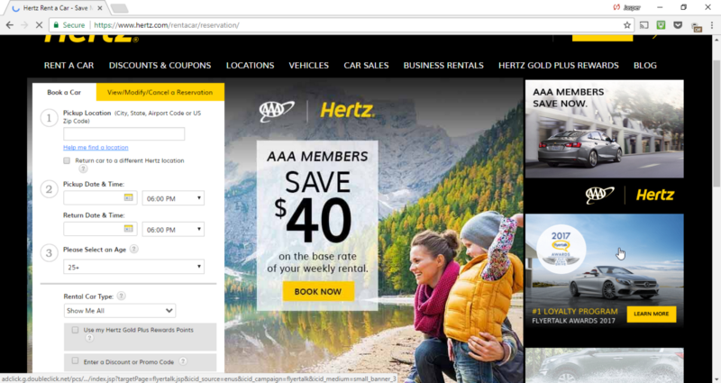
Hertz, for instance, shows their American audience a mother-daughter duo, hiking in an evergreen forest:
While they show their Russian audience a more relateable image:
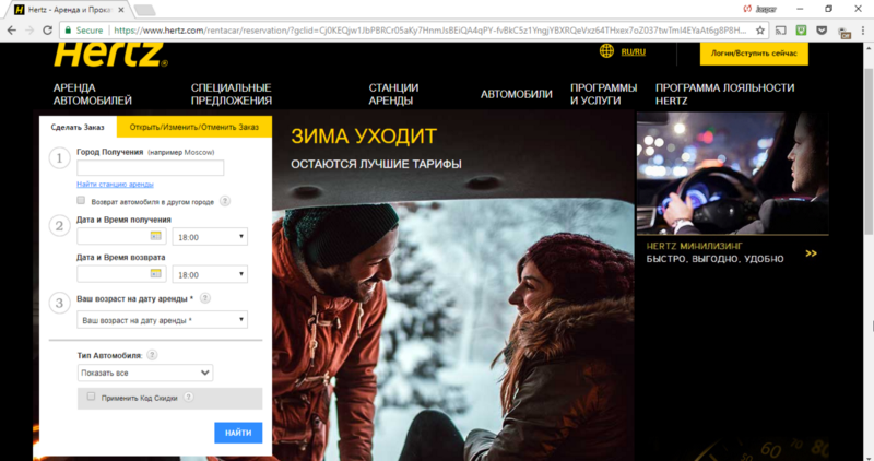
The idea behind this change is the connection the site visitor can make between the potential purchase and their existing life and behavior. A St. Petersburg local who walked home from work in 32-degree weather isn’t going to relate to a car rental that advertises driving through sun-dappled streets.
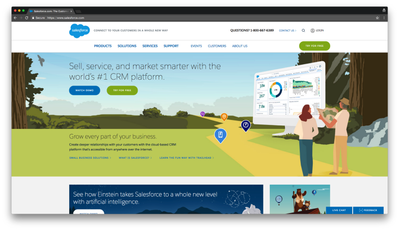
Salesforce, on the other hand, takes a more subtle approach to changing the design that they present one their homepage. In the US, visitors see this design:
— while the French would see a landscape a bit more familiar to western Europe:
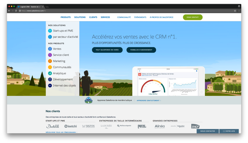
Whether the imagery you use on your homepage is small or overt — it’s just another way to connect with your consumers over details that they’re already comfortable with. It makes it feel even more like the product is built just for them.
Your homepage is presenting a new product that bridges the familiar with the unfamiliar. It’s an app that solves an old work problem. It’s a new clothing line that adds to your fall collection. It’s a new mascara that helps you put the finishing touch on your evening look. Connecting the novelty with something already familiar — whether it’s the landscape, an experience, or the local weather — helps you get one step closer to creating that bridge.
Local Events for More Touchpoints
While particular channels are easiest for marketers to reach consumers, consumers have their own preferences. Some prefer engaging with brands via social media, others via SMS, and others not at all. In fact, half of consumers are dissatisfied with how marketers choose to engage with them.
To improve the way in which you connect with consumers, you need to be able to convey the same information on the home-page of your website as you do in your email lists or in your social campaigns. Location data — available across all three mediums — can help create an omnichannel, personal experience for new and old visitors alike.
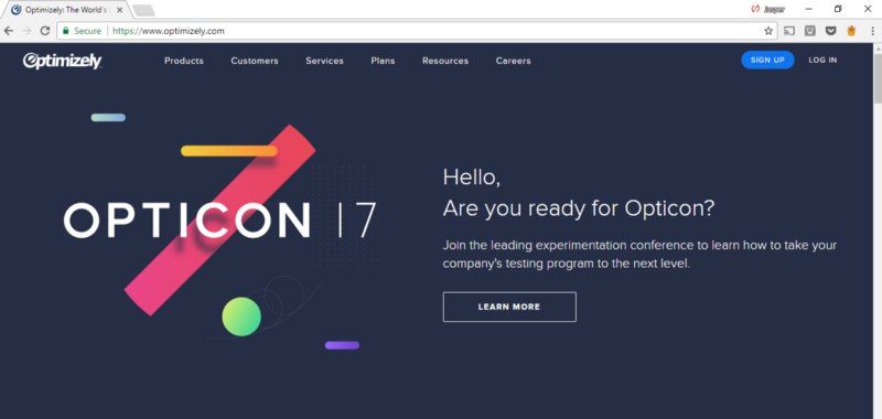
Optimizely, for instance, recommends an experimentation conference for their American audience:
While presenting their Berlin audience with more product-specific copy and design:
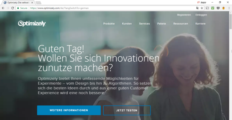
With the American homepage, Optimizely is able to nudge their U.S. audience towards helpful content that will improve their perception of the brand and its authority in the website experimentation. The German page, however, remains untouched displaying the imagery and copy that works best for that location (surely, which was tested).
If you’re not organizing in-person events, you can instead acknowledge location-specific holidays and milestones. This simply creates another touchpoint that you can have with your consumers:
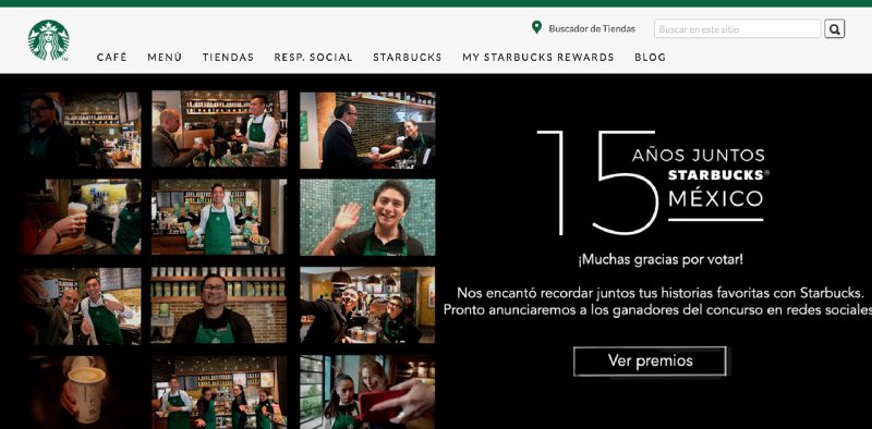
Starbucks celebrates 15 years since they first opened cafes in Mexico. They provide consumers with celebratory discounts both online and on-site.
Location-specific events and benchmarks like these tap into a sense of community. You’re grouping together consumers, based on interest and providing a limited-time opportunity for them to take advantage of. This is significantly more persuasive than the generic 20% off, last-chance-to-buy promos that are littered across the majority of websites.
Impress from the Start
By the time a user decides to click through your site or input their name and demographic information, you’ve already left the first impression. Without a homepage that’s immediately relatable, the majority of your site visitors will never experience the “welcome back, John!” or the recommendation algorithm your team has set up.
But if you leverage location-specific details about your site visitors, you can find ways to connect with them immediately. If during the first three seconds, they see a familiar landscape, an enticing, city-specific promotion, or a credible brand, and they’re more likely to spend the next thirty seconds perusing your site and clicking through to learn more.
IPinfo is a comprehensive IP data and API provider with flexible pricing plans to meet your business needs. We handle billions of API requests per month, serving data like IP geolocation, ASN, mobile carrier detection, and more. Sign up for a free account or contact our data experts to learn more.
About the author

Internet Data Expert